When...
Cozy Comfort: Keeping the Heat in Your House


Gone are the days of boring, dingy, utilitarian public washrooms. Sure, they have their place, but even highway rest stop bathrooms are upping their game with softer lighting and a piece of art or two.
It's in restaurants and bars where bathrooms are getting the heaviest makeovers. Patrons are looking for flashy exteriors and interiors full of ambience, but they're also venturing to the back of the establishment—just in the far corner, on your right—to check out the restroom.
“You have to see the bathroom in this place,” your dining partner says as they sit back down. And don't deny it, you get a bit of a thrill hearing that phrase. What could this restaurant have possibly done to make a bathroom look cool?
 Photo via Instagram
 Photo via Instagram
Frankly, restaurant and bar owners have more freedom to fly in the face of convention when it comes to creating a stunning, trendy little room for patrons to do their business. It's part of the experience. It's a necessary (and required) room to have—there are building codes to respect—but maybe most importantly, it has to look good for the ‘Gram.
If you've ever taken your dining partner's advice and checked out the bathroom in this place and found yourself blown away, pulled out your phone to snap a pic or two and thought “I wish I could have this,” here's the good news: you can!
Take a look at some of the trends happening right now in bar and restaurant bathrooms and take them to go.

Subway tiles have come back in a major way but, for this look, steer away from basic white. Throw caution to the wind and forge ahead with something more daring; black tiles with white grout, anyone? Honeycomb tiles or even exposed brick can elevate your bathroom from the ordinary.

Have you thought about a bold, patterned wallpaper? Take a page out of Vancouver restaurant Anh and Chi's book and cover the walls in something out of the ordinary. If you're worried busy paper is too much, think about how great it will look in your bathroom selfies.

Vanity lighting and showy fixtures help bring the pizzazz of trendy public bathrooms home. Whether your space is nice and bright or moody and dim, the right light makes all the difference. Find out how to set up your own lighting schemes with our handy guide.

Maybe the racy wall to wall (to ceiling?) mirror look of London restaurant Nopi isn't a domestic look but there are simple ways to bring unique mirrors into your own bathroom. Span the width of the countertop to make the room feel bigger or track down some unconventional shapes (circular and oblong mirrors are in). Surround them with vanity lights or LED backlighting to make them pop.
 Photo via Instagram
 Photo by intan Indiastuti on Unsplash
There isn't much clutter in a public washroom; soap, hand dryers and a garbage pail or two are the most of it. Keep your own accessories to a minimum to match this style. Use hideaway storage, cabinet doors that sit flush with touch latches or shelves (sparingly) to achieve the look.

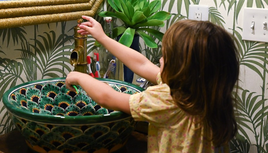
Push pedestal sinks aside in favour of more dynamic vessels. Raised bowls, sinks carved out of dazzling granite or marble—even upcycled decorative ceramic pottery can crank up the wow-factor in the bathroom. Mount that sink on a live-edge wood counter to drive the entire aesthetic home.
Defy the rules when it comes to your toilet hardware, too. Wall-mounted or floating toilets remove a lot of the bulk and help to streamline the look of the room.
When it comes to upgrading your bathroom at home, lean into the dazzling designs that impressed you at dinner. If you find yourself playing it safe, you might miss the mark here. Don't be afraid to pull out all the stops to create a flashy space that will leave your dinner guests delighted.
Source: Realtor.ca